Have you ever walked into a store and immediately felt calm, energized, or inspired? Chances are color theory played a significant role in creating that mood. As a retailer yourself, understanding and applying color theory principles in your space isn’t just about making your store look attractive, it’s a strategic approach to visual merchandising that can influence customer behavior, enhance brand recognition, and ultimately drive sales.
This guide will help you discover how strategic use of color can transform your retail space, create meaningful connections with your customers, and set your store apart from your competitors.
Why color theory matters for your store
Our brains process visual information first, and color is the most immediately impactful element of that visual experience. For retailers, color theory provides a framework for creating visually appealing displays, cohesive brand experiences, and environments that evoke specific emotions and behaviors in customers.
In retail, this connection between color and emotion becomes a powerful merchandising tool. The strategic application of color in your retail space offers significant benefits:
- Enhanced brand identity: Your color choices become a visual shorthand for your store’s personality and values.
- Emotional connection: The right palette can make customers feel exactly how you want them to feel when shopping with you.
- Customer guidance: Strategic color placement can direct traffic flow through your store, highlighting new arrivals or sale items as needed.
- Increased dwell time: Appropriate color choices can make your space more comfortable, encouraging customers to browse longer.
- Higher sales conversion: When products are displayed against complementary background colors, they become more visually appealing and more likely to sell.
Creating your store’s color story
Developing a cohesive color story for your retail space involves thoughtful consideration of your brand identity, target customers, and merchandise. Here are some questions to ask yourself to get started.
- What emotions do you want customers to feel in your store? Do you want them to feel energized and excited, or calm and focused?
A store that sells books for kids might use bright primary colors to create excitement and playfulness, while an eco-friendly skincare brand might choose soft blues and greens to promote relaxation and tranquility.
- What are your brand colors, and how should they be incorporated? Your store’s color scheme should align with your existing brand identity.
If your clothing boutique’s logo and branding feature teal and copper, that should play a role in your fashion merchandising. You might use teal for accent walls behind neutral garments and copper fixtures to display jewelry and accessories.
- Who is your target customer? Different demographics respond to colors differently.
Stores offering products from fair-trade food brands might opt for earthy greens, warm terracottas, and natural tones that communicate sustainability and global consciousness.
- What products are you selling? The colors you choose should complement your merchandise rather than compete with it.
A store that sells gold jewelry might use navy blue or deep purple backgrounds to make the merchandise shine, while a plant shop might use more neutral backdrops to let the colors of the blossoms really stand out.
- What is your store’s lighting situation? Natural light versus artificial lighting can dramatically change how colors appear.
Stores with abundant natural light can use cooler colors without the space feeling cold, while those with limited windows might need warmer tones to create a welcoming atmosphere.
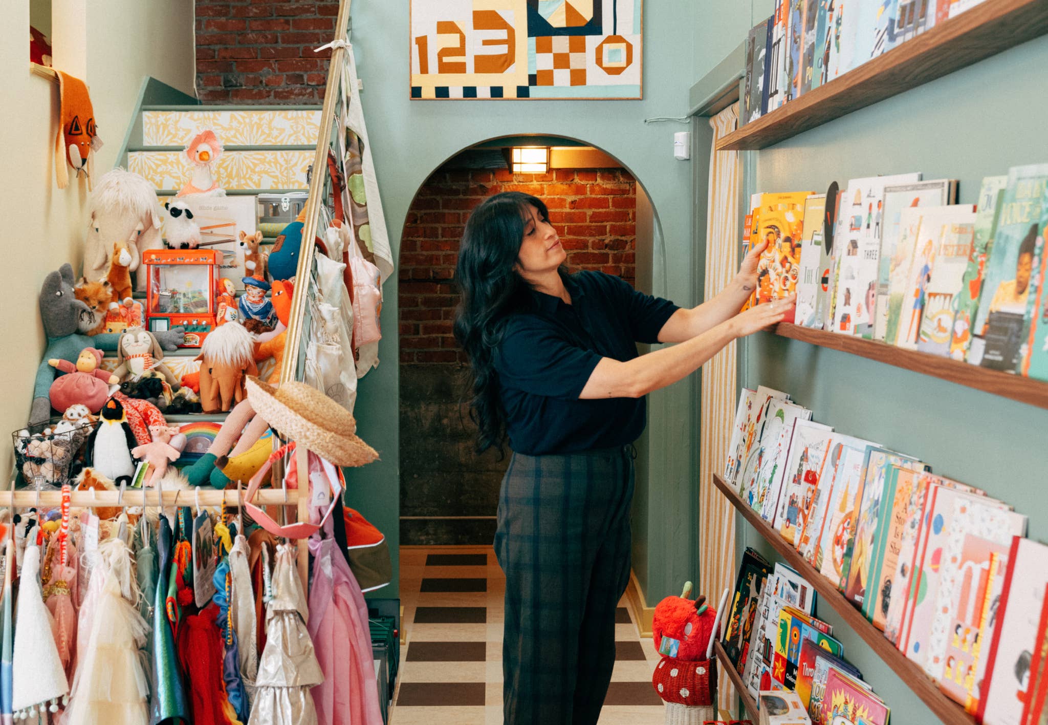
Practical tips to bring your color strategy to life
Once you’ve established your color palette, it’s time to thoughtfully implement it throughout your retail space. This is where theory transforms into tangible customer experiences. The most successful retailers don’t just select colors—they strategically deploy them to guide behavior, create emotional connections, and showcase their merchandise in the most flattering way possible.
The following strategies offer different approaches to bringing your color story to life. You might find that some resonate more with your particular retail concept than others, or you might combine several techniques to create a multilayered approach. The key is to implement with intention, ensuring every color choice supports your brand identity and enhances the shopping experience.
Creating multisensory color experiences
First, identify the feelings or associations you want your colors to evoke. Then, enhance these through complementary sensory elements. For warm colors, consider incorporating textured materials or scents with spicy or woody notes. For cool colors, add smooth surfaces or fresh, clean scents.
Example: A coffee and tea specialty shop using rich brown and amber tones might enhance this warm color palette by playing low-tempo acoustic music, using gentle lighting that mimics morning sunlight, and allowing the natural aroma of freshly ground coffee beans to fill the space, creating a multisensory experience that makes customers want to linger.
Zoning with color
Create a floor plan that identifies distinct functional areas of your store. Assign different colors from your palette to each zone based on the desired customer behavior in that area. Use more stimulating colors where you want customers to make quick decisions and calmer colors where you want them to linger.
Example: A sporting goods store might use energetic red in the fitness equipment section to motivate quick purchasing decisions, calming blue in the fishing and outdoor gear area where customers typically spend more time comparing technical features, and a neutral taupe in the footwear section where comfort and fit consideration require focused attention.
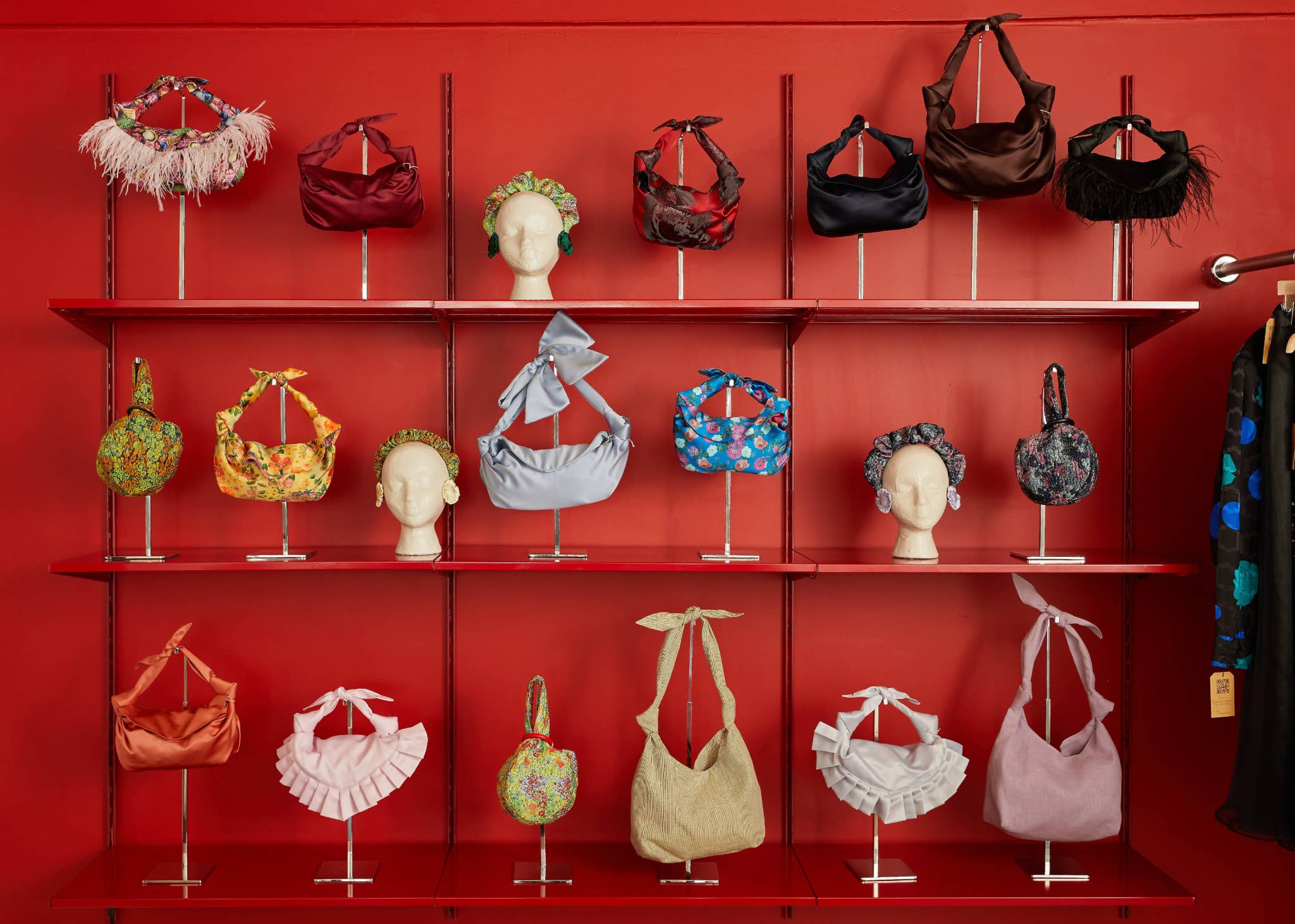
Color blocking
Select merchandise of similar colors and group them together to create visual impact. Arrange products in gradations from light to dark or by color families to create pleasing patterns. For maximum effect, use color blocking in high-visibility areas like window displays or near store entrances.
Example: An aromatherapy boutique might arrange its collection of handmade soaps in a striking color progression from pale pink to deep burgundy, creating a visually compelling installation that transforms these everyday items into an artistic display while highlighting the rich, natural pigments used in its products.
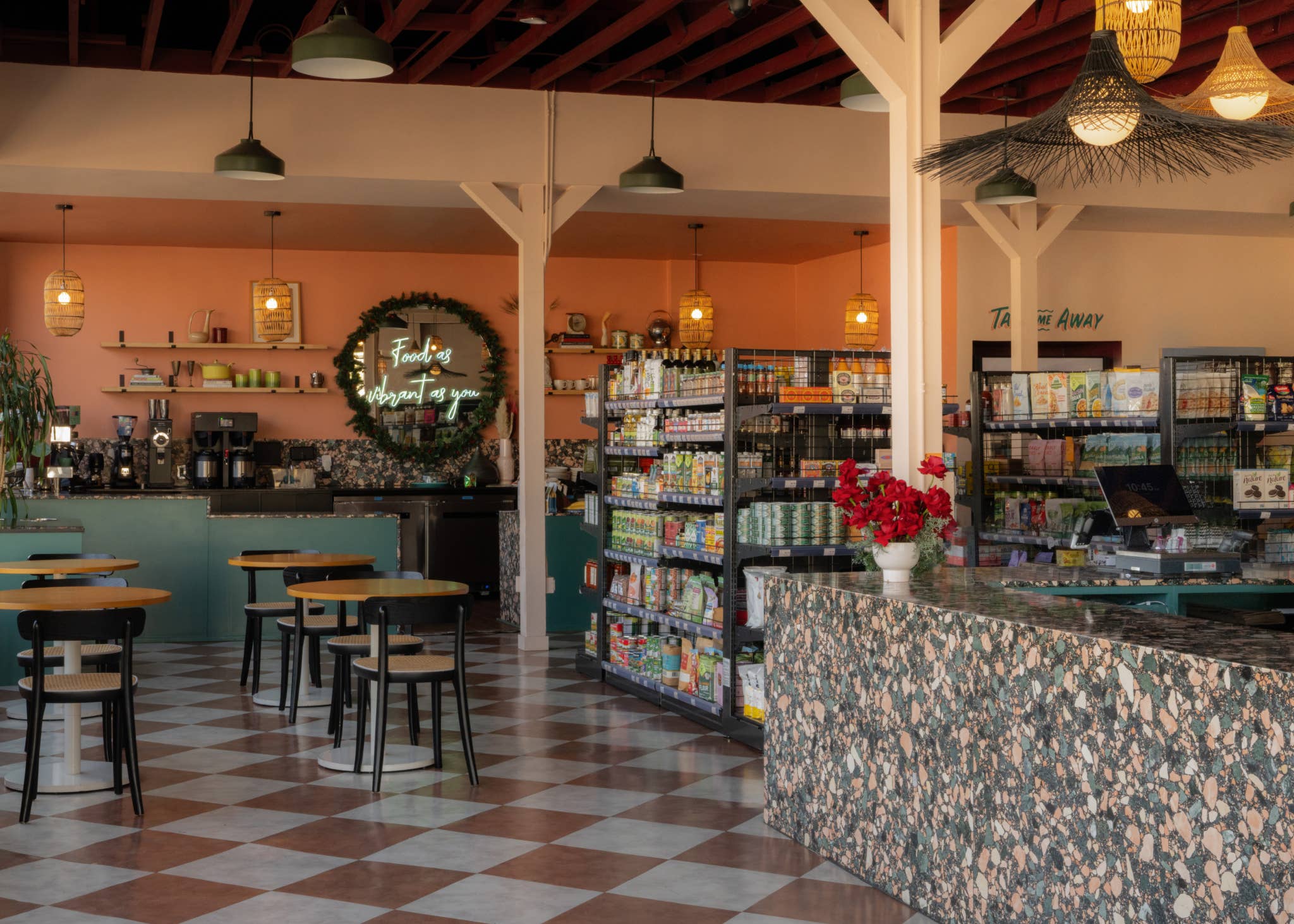
The 60-30-10 rule
Select three colors from your palette: a dominant neutral or subtle color, a secondary color with medium visual weight, and a bold accent color. Apply the dominant color to approximately 60% of your visible space, your secondary color to about 30%, and your accent color to the remaining 10%.
Example: A musical instrument shop might use warm wood tones for 60% of its space (floors, acoustic paneling, instrument displays), deep burgundy for 30% (wall accents, seating areas, carpet), and metallic silver for 10% (hardware, signage, and display lighting), creating a balanced environment that feels both professional and inspiring for musicians.
Common color mistakes to avoid
Even with the best intentions, retailers sometimes make color missteps:
Using too many colors
Instead of using eight different colors throughout your store, choose a core palette of three colors plus one to two accent colors that can rotate seasonally.
Not being mindful of cultural color associations
Be mindful that white symbolizes mourning in some Eastern cultures, red has different connotations in different regions, and certain color combinations are strongly associated with specific countries or holidays.
Not thinking of social media
Test how your store colors appear in photographs before finalizing, as some colors (particularly very bright or very dark hues) can be difficult to capture accurately on camera.
Leaving people out
Forgetting about color accessibility may exclude customers with color-vision deficiencies. Ensure that important information isn’t conveyed by color alone, and provide adequate contrast for signage and wayfinding elements.
Ignoring lighting differences
Colors look dramatically different under various lighting conditions—that perfect sage green can look like muddy gray under fluorescent lights or vibrant mint under LEDs.
Final thoughts
Color is perhaps the most powerful tool in your visual merchandising toolkit. By thoughtfully applying color theory principles to your retail space, you can create an environment that not only showcases your products effectively but also forms emotional connections with your customers.
Whether you’re refreshing an existing space or designing a new store from scratch, strategic color choices can transform the shopping experience, strengthen your brand identity, and ultimately drive sales.
Implementation requires both planning and flexibility. You’ll want to consider permanent elements like wall colors and fixtures, as well as adaptable components that can be refreshed seasonally or as trends evolve. Remember that lighting, product inventory, and even neighboring businesses can influence how your chosen colors perform in practice, so be prepared to make adjustments as needed.
Ready to transform your retail space with strategic color choices? Shop now on Faire for products that can bring your color story to life, from display fixtures to signage and packaging.